
So I knew I was the right choice to help them stand out with some killer retro-inspired visuals across their brand
They had an established character design “Cluckberry” chicken which they wanted incorporated, whilst also being happy for them to be updated and redrawn into additional poses when needed, as long as they kept their retro vibes.
The name had to stay, too, but the logo needed its own retro twist to it, along with all the brand elements such as colour palette, brand fonts, icons and the packaging for their coffee.
The Coffee Roasters "Sanctuary Coffee" reached out to me in 2022 for help in elevating and revamping their branding and packaging for the brand. Their goals were to have a clear visual direction influenced by the vintage and retro style in which I specialised in, whilst also being modern and versatile across applications; they wanted to stand out in a very busy coffee roaster sector, which is heavily visually leaning towards clean and modern design.
A project born out of a passion for coffee and retro design


We started the project with some initial moodboarding and visual direction creation to align on an agreed direction, along with some brand discovery sessions, which included market research and establishing the brand in the market.
The key creative direction and visual inspiration was vintage packaging, specifically cereal packaging from the 50s, which lends nicely into the mascot style of the brand's chicken character, "cluckberry"
Early on, we established a strong, confident colour palette inspired but the 50s era of style. This was worked together with the client over multiple calls to help build a solid graphic language framework to begin building out the brand and the packaging.
Finding the Vintage inspiration
The outcome was a strong, fun, bold vintage-inspired brand direction, which was then used to create a bold logo, supporting elements and cereal box-inspired packaging for their retail coffee. This successfully elevated their brand, adding more fun and stand-out graphics.
The vintage-inspired direction really helped bring home their mission of supporting rescue animal sanctuaries through revenue donations, the vintage retro elements helped bring out the human elements of the brand and help customers relate to the messaging and the heart of the brand which is coffee and the love of animals.
We created an updated retro-style logo to be used across multiple platforms and applications, including print and online. Brand colour palette aligning any communications and brand usage to help further establish the brand whenever it is applied and Complementary brand fonts which, when applied to any output, helped spread the brand.
Nailing our visual direction

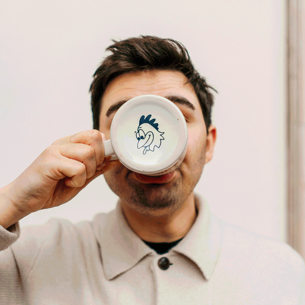
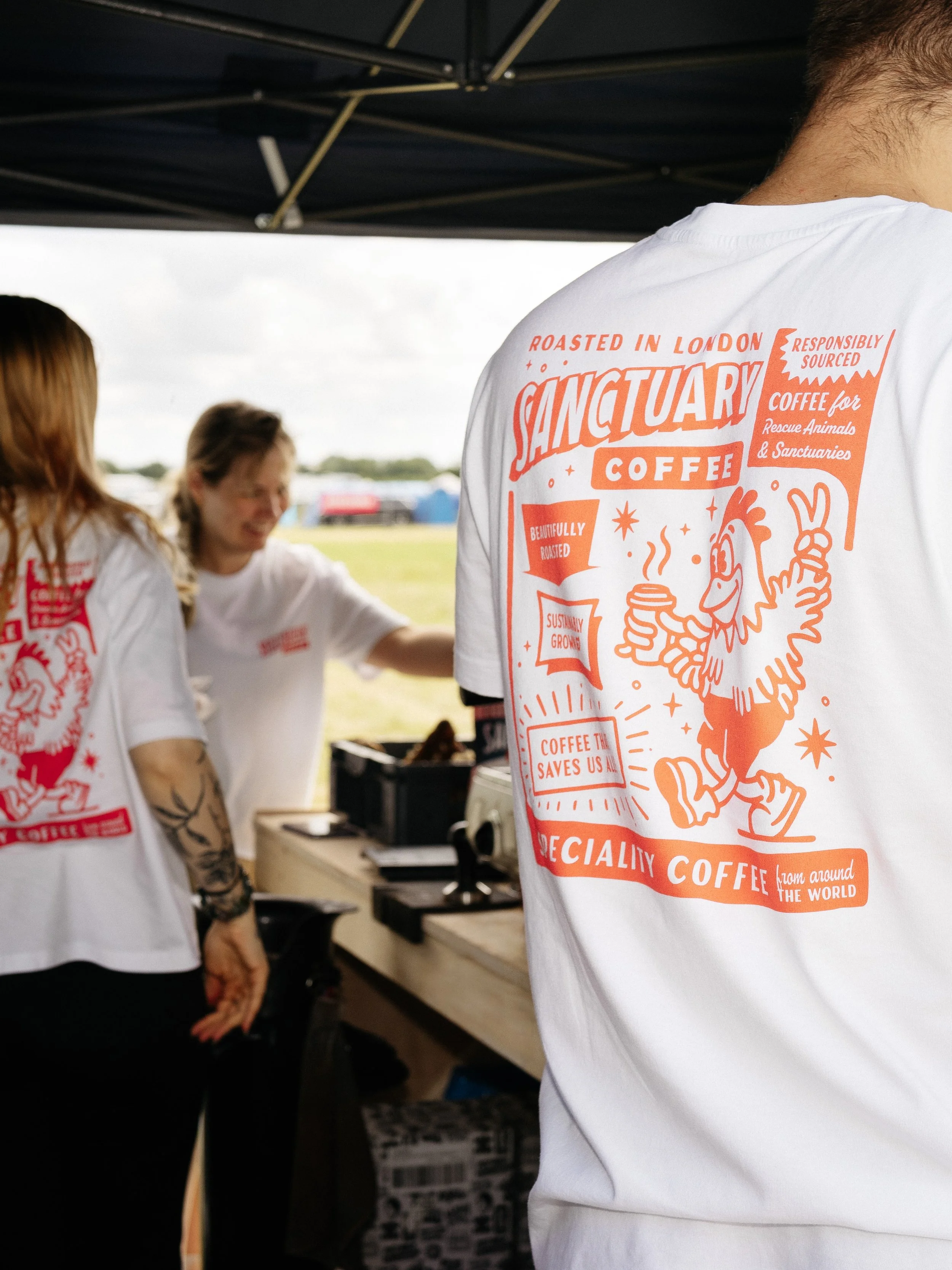
Refreshed and diversified mascot illustrations, we redrew "Cluckberry" with bolder lines and added some alternative poses to make him more versatile for the brand, such as summertime cluckberry and cluckberry the postie, allowing him to be used in multiple projects, such as summer cold brew, matcha tea and sitewide infographics. This was all integral to make the brand and "Cluckberry" more human, add more dimensions to the outputs and generally make the brand feel lived in and not just "another coffee brand"
Adding some depth to Cluckberry and to Sanctuary Coffee


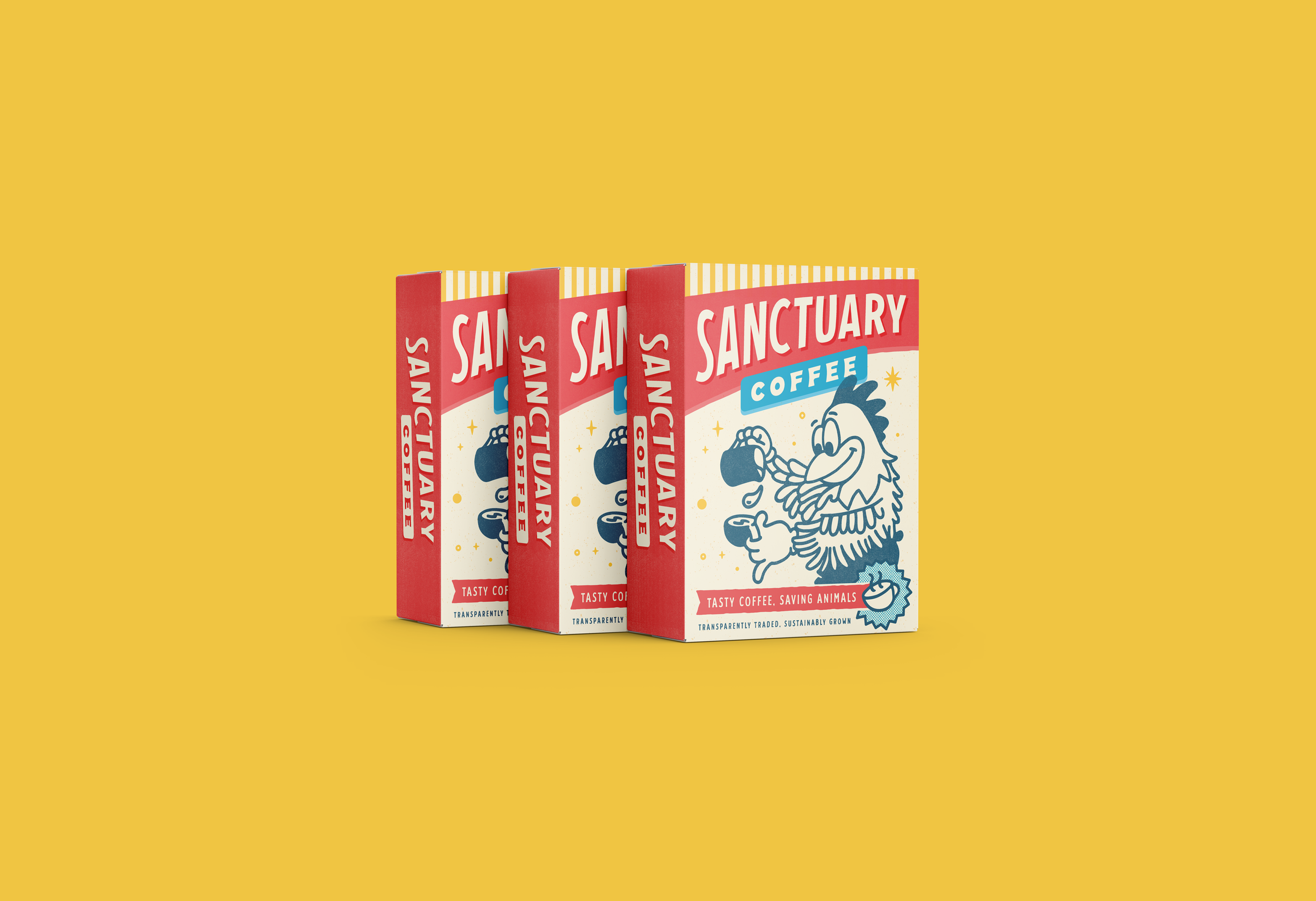
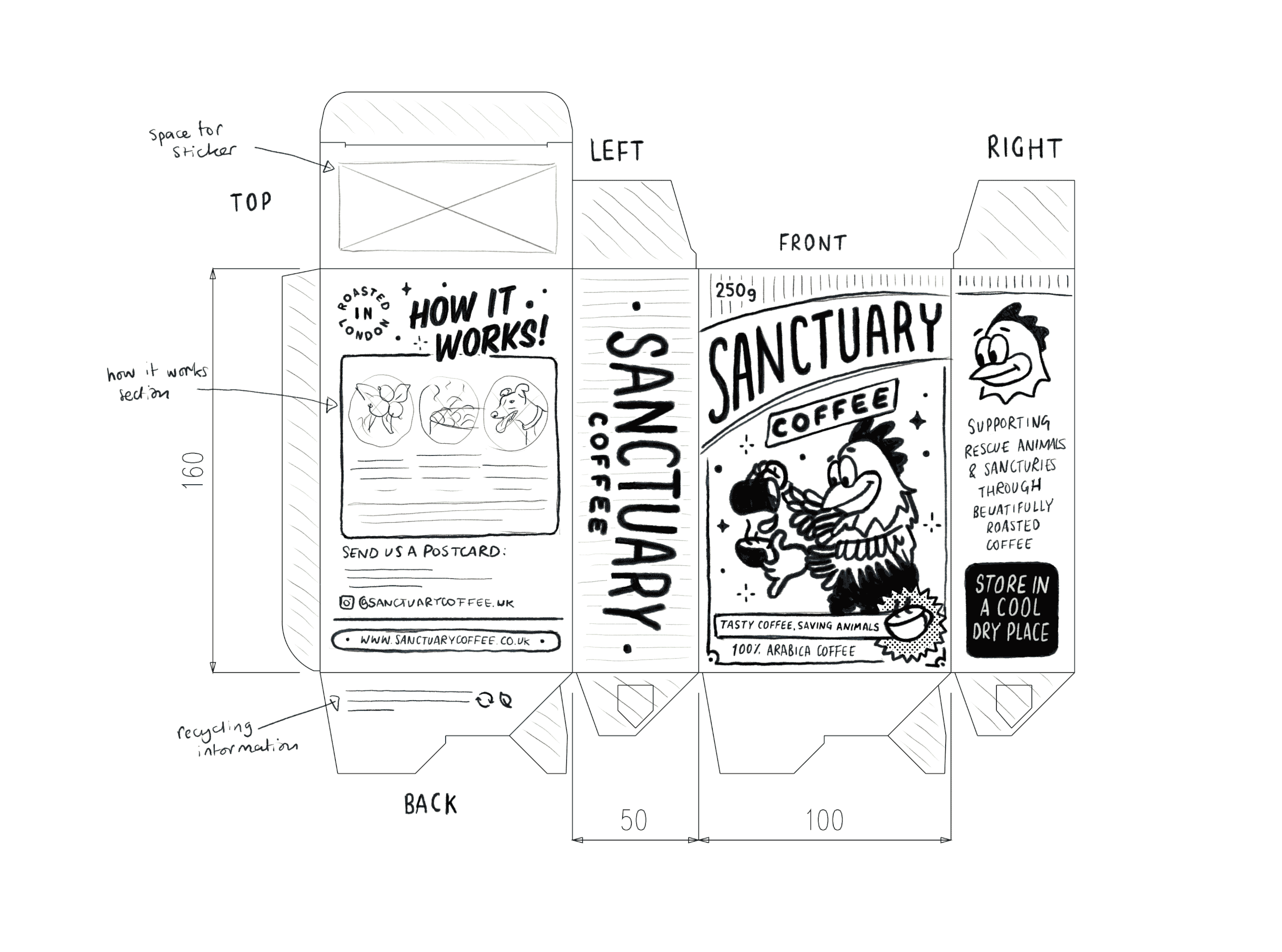
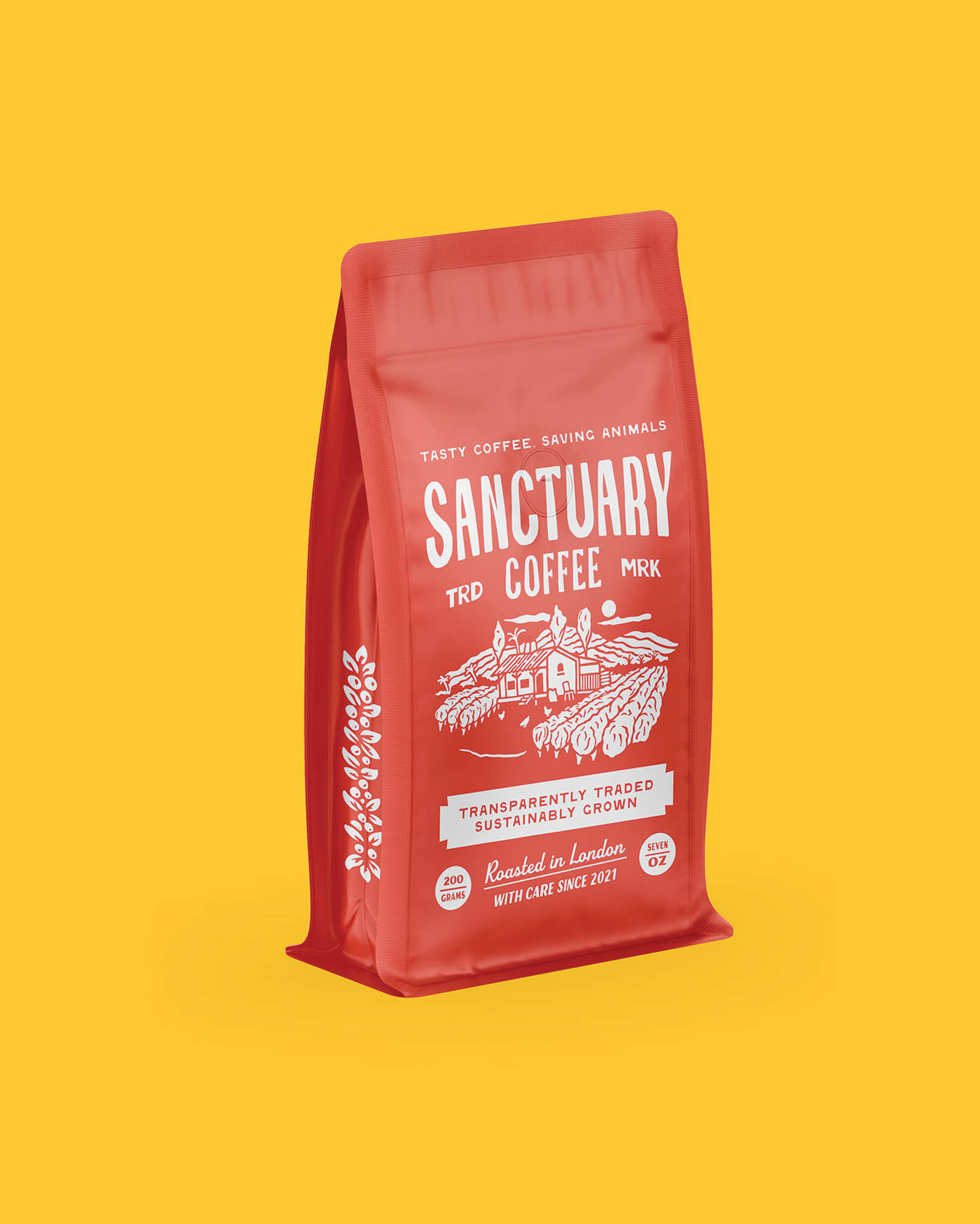
And now for the headline act; the retail coffee packaging, which was one of the highlights of the project, gave us the first opportunity to bring together all the brand elements we had created into a fun 50’s cereal box-inspired coffee packaging.
This allowed for lots of fun details, such as halftone texturing, illustrated icons, and offset effects, really bringing all the elements we'd created together into one standout piece.
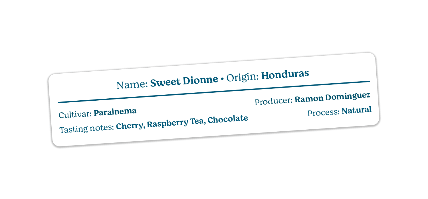
An issue we had to solve was labelling the individual coffees, of which there were multiple on offer from the roaster, and clearly providing the information for each coffee, including tasting notes, roasting process and origin. We did this by designing a simple label which matched the style and blended into the box layout.
THE HEADLINE ACT OF A COFFEE BOX
The coffee box was an instant hit with customers who were sharing it across social media and even retaining the box after finishing the coffee, marking the project as a success in elevating the brand and helping them stand out in a busy market

This was just the start. Having established the vintage-inspired visual direction, we went on to create other projects for Sanctuary Coffee, including further packaging for other products such as wholesale coffee bags, coffee bags for speciality coffees, packaging for matcha tea, coffee takeaway cups, promo poster artwork, All with the same fun, bold retro style.
JUST THE BEGINNING


BASEBALL CARDS FOR THE COFFEE LOVERS
One of my personal highlights of additional projects for "Sanctuary Coffee" was the creation of baseball card-inspired information cards.
Which were individually created for each of their coffees, which included all the relevant coffee information for each coffee, Origin, tasting notes, roasting process and also bespoke-designed illustration of the linked animals and custom lettering.

The work was really well received by the client, leaving a wonderful client testimonial:
PROJECT IMPACT
"We have worked with Simon on all aspects of our branding since 2022 and we wouldn't be the same without him! We first approached him to create branding for us around a box design, since then we have been building on this with further packaging projects and merch artwork creation. Our branding really makes us stand out amongst our competitors and we are always blown away with each project. The proof is in the feedback from our customers, we are always getting compliments on our branding and packaging! Simon is an absolute pleasure to work with and always takes the time to listen to our ideas. It means a lot to us that Simon genuinely cares about our business and we value his expertise immensely."
Rhian Nolan Co-Founder of Sanctuary Coffee
The creation of the Sanctuary Coffee box and Information Cards are my particular favourite highlights of this project and partnership. But truly seeing the brand grow, be loved and shared has been the best part of this project. This project shows how bold retro design can give a small brand a big personality in a very busy sector.