

Honouring 30 years of Plymouth heritage
The Canadian Muffin Co. has been a fixture of central Plymouth for over 30 years. A proper part of the local food scene. The kind of place generations of locals know by name and have grown up popping into for a coffee and a muffin on the way through town.
When the café came under new ownership and joined the wider hospitality group, the brief wasn't to start from scratch. It was to keep the name and refresh everything around it. That's a trickier line to walk than building from zero. Go too modern and you strip out the soul that made the place loved in the first place. Stay too rooted in the old and the brand doesn't feel fresh enough to bring people back through the door. The goal was a refresh that honoured the legacy whilst pulling the brand firmly into a new chapter.
The wider goals were tight. MUFFIN had to be front and centre. Red and white only, no compromise. A fun muffin mascot to give the brand a face. And the whole thing needed to feel at home next to the rest of the hospitality family it now belonged to.
I'd already built brands across that wider family. Glory Days Magazine (and the now-legendary Gloria Daze), the Rocket Man for Rockets & Rascals, the Toze Hospitality Group tiger. The shorthand was already there. The trust was already built. That made the job easier to land at pace.
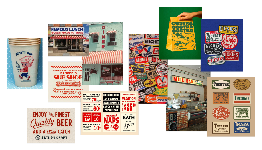
Finding the trucker-vibe sweet spot
We kicked off with moodboarding, as you do. The first direction was a bit off. The earliest reference was an Italian restaurant with a New York feel. Interesting, but not quite landing on the page.
The real unlock came with a reference featuring a trucking vibe. Bold blocky type, Americana energy, a touch of vintage roadhouse. Boom. That was the lock-in. From there, the direction wrote itself.